by Dan Jurgens (story and art)
DC Comics, 1988 - 1989
In the Fall of 1987, Dan Jurgens, a writer and artist at DC comics, began work on a Flash Gordon nine-issue series (Jurgens had previously been the main writer and artist for Booster Gold, which DC had decided to discontinue).
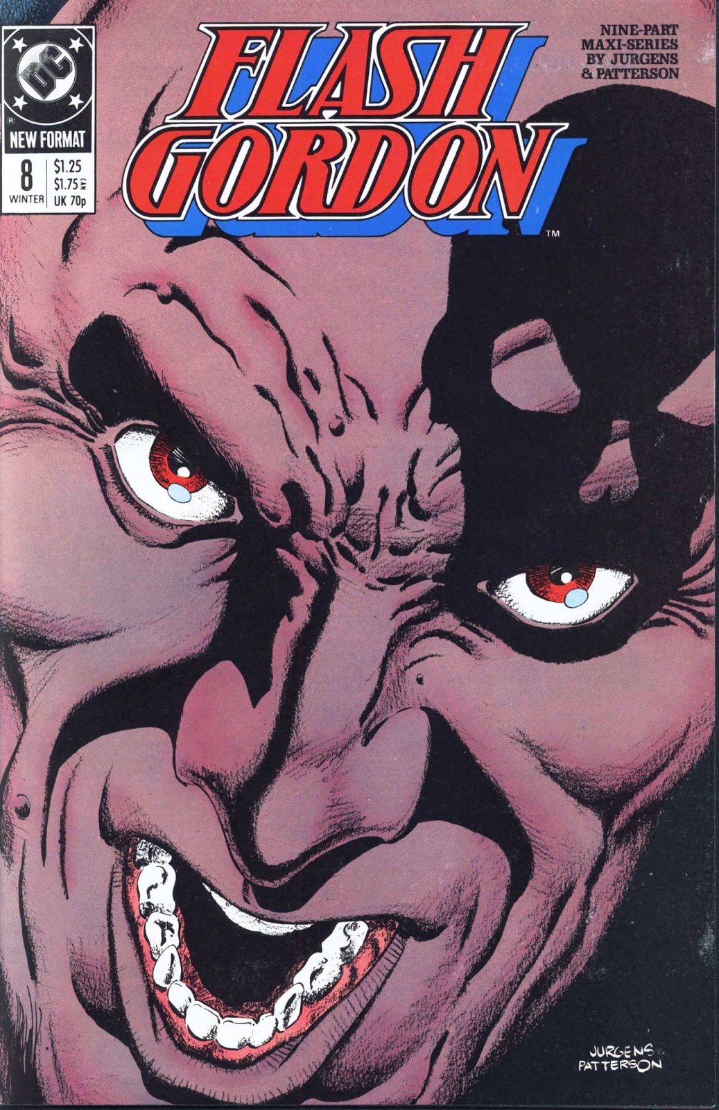
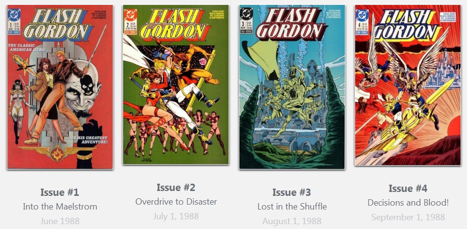
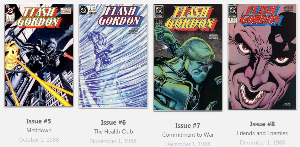
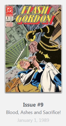
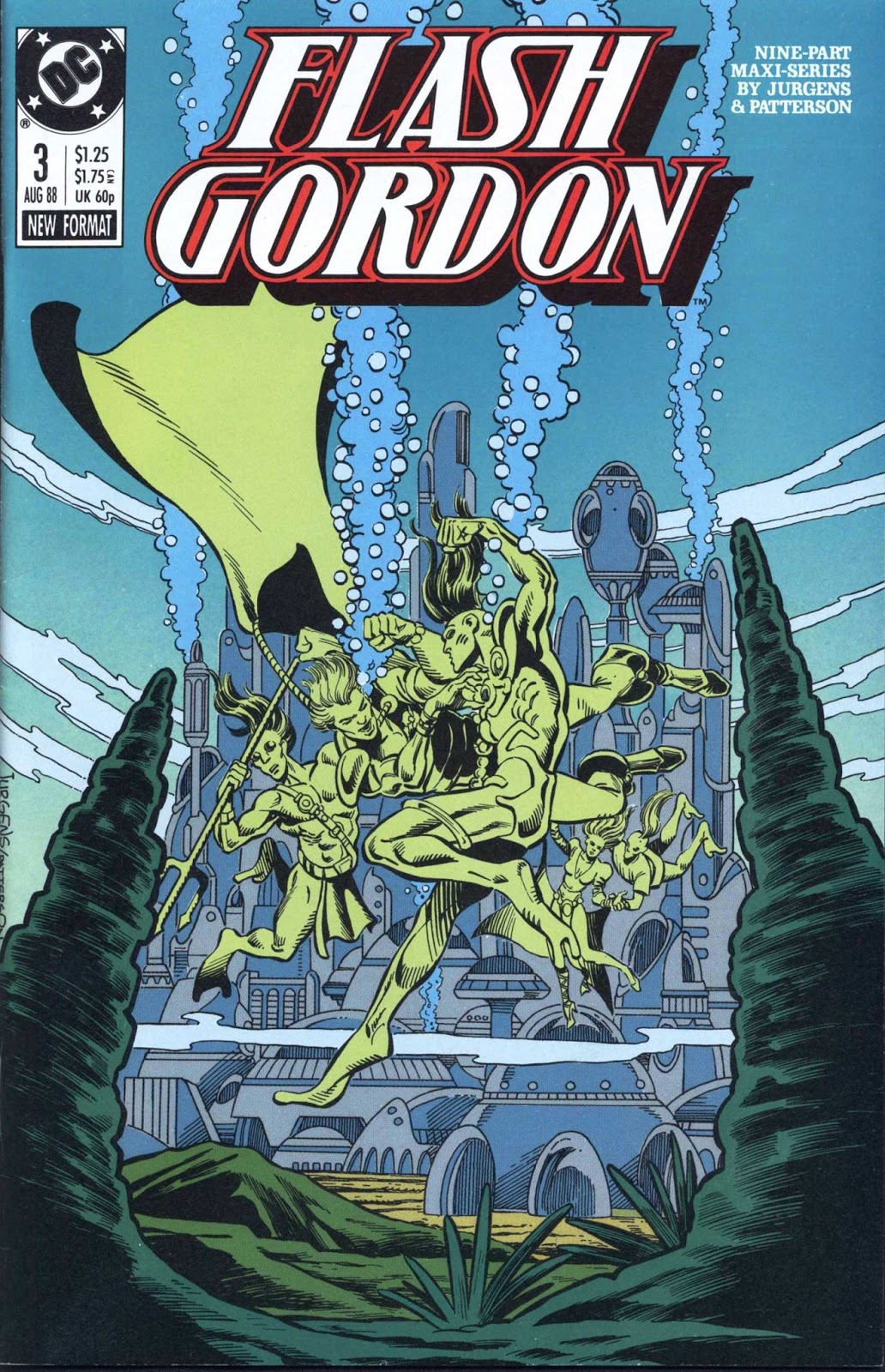
The series debuted with issue 1 in June, 1988 and ended with issue 9 in January 1989. It was printed under the auspices of DC's 'New Format' line, a euphemism for comic books that did not adhere to the Comics Code, and were printed on a higher grade of paper.

In the case of Flash Gordon, Jurgens opted to mimic the plotting used in the 1980 Dino De Laurentiis film: Flash and Dale Arden are kidnapped by a crazed Dr. Hans Zarkov, who flies them in his rocket ship to the planet Mongo, where all manner of adventures ensue.
Jurgens made a number of modifications to the characters. For example, Flash is a former Boston Celtics player who runs a chain of sporting goods stores; he is cast as a self-centered, aging playboy. Dale Arden is the epitome of the modern, independent woman who can take care of herself and needs no rescuing.
Many of the races of Mongo and their heroes that were present in the original Flash Gordon comics, and also the 1980 movie, are represented here.
This reboot of Flash Gordon is something of a mixed success. While it certainly cannot have been easy for writer Jurgens to craft a narrative that avoided the overt camp of the film, while remaining true to source material derived from a 1930s comic strip, this 1988 series has an uneven quality.

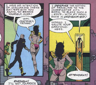
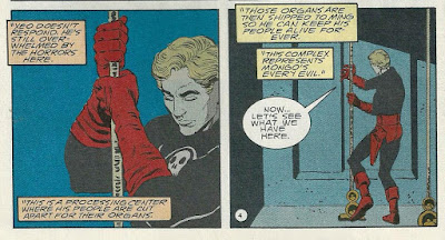
A major weakness comes from Jurgens's decision to re-color Ming and the other inhabitants of Mongo from their original yellow / 'Asian' skin tone to a horrible, muddy, gray skin coloration. Jurgens indicates he did this to avoid recapitulating the 'racism' of the original comics, which were published during the 'Yellow Peril' era of American pop culture.
However noble a goal this was, as one letter-writer points out, this recoloring simply opens Ming and company to accusations of victimizing South Asians and Arabs..........?!

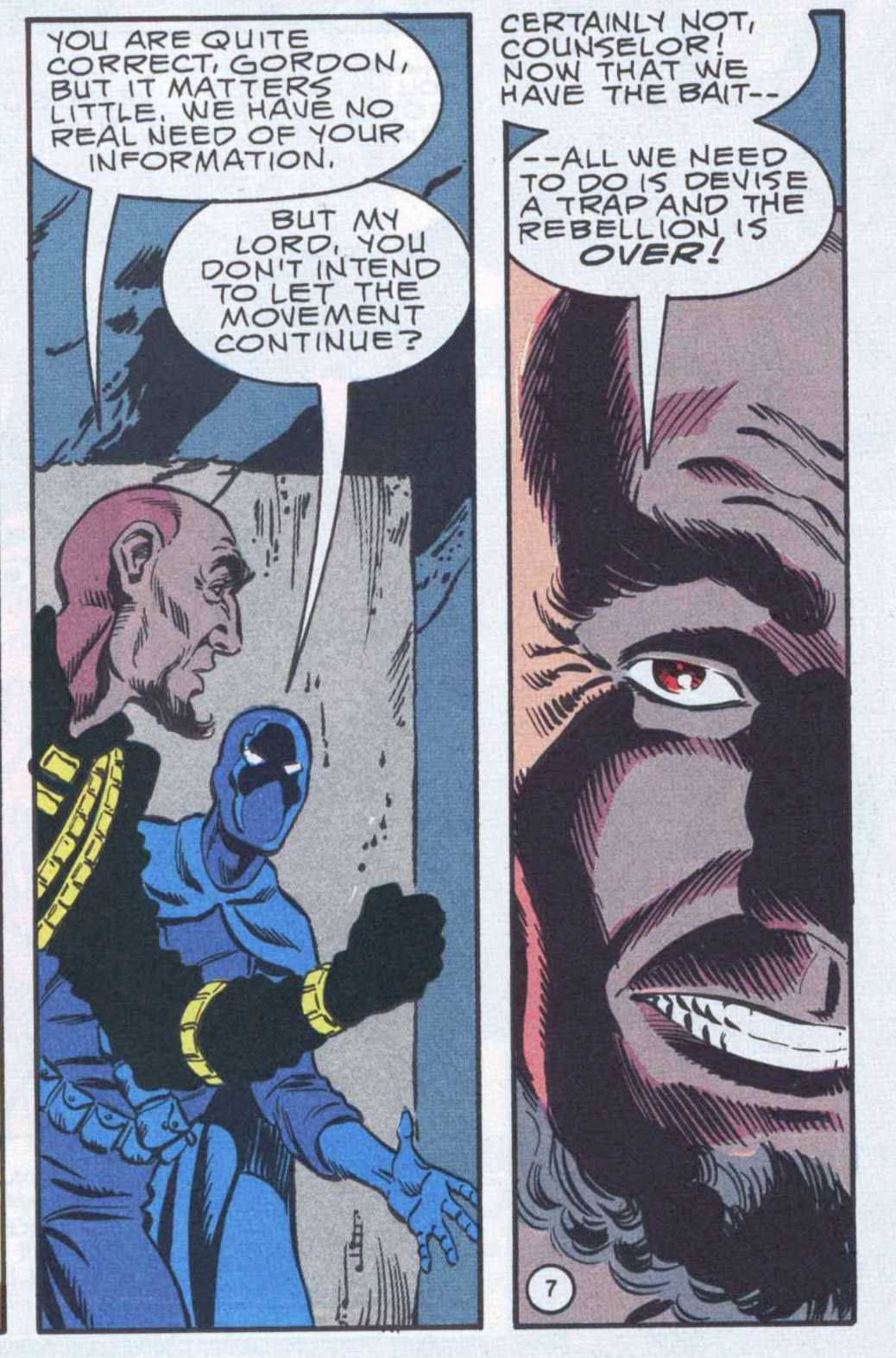
Another weakness is Jurgens's decision to convert Flash to a Social Justice Warrior, a conversion occasioned by his growing realization that, away from the opulence and decadent glitter of Ming's palace, Mongo is a world of inequality. This comes across as a too-contrived deviation from the series' roots.

The series does have its strengths. Each issue ends on a 'cliffhanger' note designed to recall the old movie serials. In order to accommodate these, the narrative moves along at a fast pace.
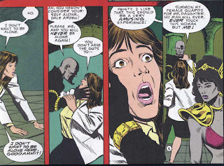
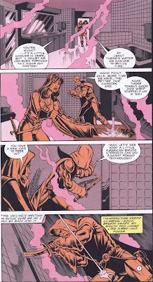
As well, Jurgens gleefully plays up the cheesecake elements of the film, giving every female character a 'Fredricks of Hollywood' appearance that includes plentiful shots of T & A.

Overall, Jurgens' artwork is of good quality, featuring some nicely done action sequences that benefit from Jurgens' ability - as the series writer - to pick and choose when and where to insert his speech balloons.
Where 'Flash Gordon' suffers is in the colors, done by Anthony Tollin. It's my impression that by 1988 DC had abandoned the Flexographic printing process for their comic books, but whatever system the Worldcolor printing company replaced it with was almost as bad.......the color schemes used in 'Flash' all have that dull, flat appearance that compromised so many comics from the 80s.
Take, for example, this panel from issue 7, where the attempt to rendition Flash rappelling down an elevator cable in the darkness comes across as an eye-hurting melange of drab tones...........
Summing up, DC's 'Flash Gordon' reboot is a competent comic book series, albeit it one that doesn't really succeed in being innovative, despite its earnest efforts to inject notes of social relevance and a more 'modern' mentality to character development.
Jurgens made a number of modifications to the characters. For example, Flash is a former Boston Celtics player who runs a chain of sporting goods stores; he is cast as a self-centered, aging playboy. Dale Arden is the epitome of the modern, independent woman who can take care of herself and needs no rescuing.

Many of the races of Mongo and their heroes that were present in the original Flash Gordon comics, and also the 1980 movie, are represented here.
This reboot of Flash Gordon is something of a mixed success. While it certainly cannot have been easy for writer Jurgens to craft a narrative that avoided the overt camp of the film, while remaining true to source material derived from a 1930s comic strip, this 1988 series has an uneven quality.
A major weakness comes from Jurgens's decision to re-color Ming and the other inhabitants of Mongo from their original yellow / 'Asian' skin tone to a horrible, muddy, gray skin coloration. Jurgens indicates he did this to avoid recapitulating the 'racism' of the original comics, which were published during the 'Yellow Peril' era of American pop culture.
However noble a goal this was, as one letter-writer points out, this recoloring simply opens Ming and company to accusations of victimizing South Asians and Arabs..........?!
Another weakness is Jurgens's decision to convert Flash to a Social Justice Warrior, a conversion occasioned by his growing realization that, away from the opulence and decadent glitter of Ming's palace, Mongo is a world of inequality. This comes across as a too-contrived deviation from the series' roots.

The series does have its strengths. Each issue ends on a 'cliffhanger' note designed to recall the old movie serials. In order to accommodate these, the narrative moves along at a fast pace.
As well, Jurgens gleefully plays up the cheesecake elements of the film, giving every female character a 'Fredricks of Hollywood' appearance that includes plentiful shots of T & A.


Overall, Jurgens' artwork is of good quality, featuring some nicely done action sequences that benefit from Jurgens' ability - as the series writer - to pick and choose when and where to insert his speech balloons.
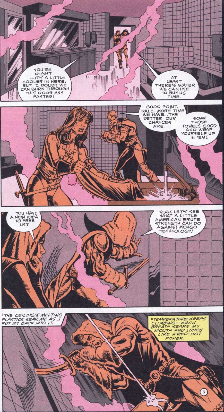
Where 'Flash Gordon' suffers is in the colors, done by Anthony Tollin. It's my impression that by 1988 DC had abandoned the Flexographic printing process for their comic books, but whatever system the Worldcolor printing company replaced it with was almost as bad.......the color schemes used in 'Flash' all have that dull, flat appearance that compromised so many comics from the 80s.
Take, for example, this panel from issue 7, where the attempt to rendition Flash rappelling down an elevator cable in the darkness comes across as an eye-hurting melange of drab tones...........

Summing up, DC's 'Flash Gordon' reboot is a competent comic book series, albeit it one that doesn't really succeed in being innovative, despite its earnest efforts to inject notes of social relevance and a more 'modern' mentality to character development.