Tuesday, March 15, 2016

Behold the Man

'Behold the Man'
Adapted from the short story by Michael Moorcock by Doug Moench (script) and Alex Nino (art)
from Unknown Worlds of Science Fiction (Marvel / Curtis) issue 6, December 1975


Frank Brunner's front cover illustration of the 6th and final issue of Marvel's Unknown Worlds of Science Fiction certainly was a dramatic, if contrived, envisioning of the Michael Moorcock short story Behold the Man

The short story, first published in 1966, and then later as a novel in 1969, is probably Moorcock's best-known story.

The problem with Behold the Man is that, aside from its provocative plot, it's not very good. 

The time travel elements of the story are perfunctory, and most of the content is centered on a tedious, belabored recitation on the psychoses of the lead character, a German Jew named Karl Glogauer.

Needless to say, a story like Behold the Man was just the sort of 'controversial' material that Marvel editor Roy Thomas loved to showcase in Marvel's black and white magazines. It was part and parcel of his desire to have such comics seen as a mature, meaningful, 'adult' art form.

Thomas pontificates about his decision to run a comic-book adaptation of the story in a self-indulgent Introduction (scanned and posted below).

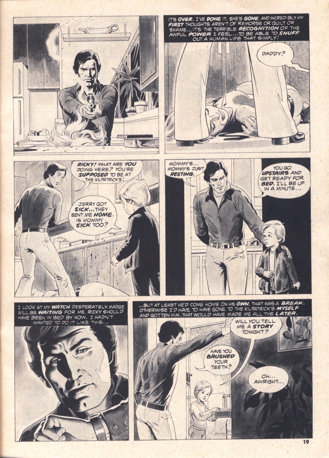
Doug Moench's script for the adaptation is too wordy to be effective. It also suffers from pretentiousness, such as the inclusion of a quote from Carl Jung, and excerpts from the Gospels, as framing devices.


What makes Behold the Man worth scanning and posting here, is Alex Nino's artwork. 

Despite the overwritten nature of Moench's script, which not only requires the use of 5 - 7 panels per page to accommodate, but the inclusion of large blocks of external narration text in many of these panels, Nino is able to give the artwork his own distinctive approaches. 

This takes the form of filling the backgrounds of the panels depicting the events in Palestine with palm tree fronds, and cross-hatching motifs that mimic the texture of palm fronds weaved into thatching, in an effort to give them a visual style in keeping with the story's placement in the 'New Testament' era. 

It's these little touches, done in very little drawing space, that overcome the low-res quality of the printing, that confirm that Nino was one of the better artists to contribute to the Marvel and Warren black-and-white magazines of the 70s.


Saturday, March 12, 2016

Book Review: Oath of Fealty

Book Review: 'Oath of Fealty' by Larry Niven and Jerry Pournelle
1 / 5 Stars

‘Oath of Fealty’ was first published in hardback in 1981. This Pocket Books paperback edition (top) (324 pp) was published in August, 1982. 

Pocket Books released other editions with different cover art (bottom) during the remainder of the 80s.

From the mid 70s to the late 80s, the duo of Niven and Pournelle were among the most visible – and best-selling – in sf, with titles such as The Mote in God’s Eye (1974), Inferno (1976), Lucifer's Hammer (1977), Dream Park (1981), Footfall (1985), and The Legacy of Heorot (1987). Some of these were good, others, mediocre. 


Unfortunately, ‘Oath of Fealty’ is in the latter category.

‘Fealty’ is set in the near future, in Los Angeles. An arcology, called Todos Santos, has been erected on a tract of deserted land on the outskirts of the city.

[Arcologies were not unusual in 80s sf, particularly in cyberpunk…..William Gibson refers to them in his ‘sprawl’ novels].

Todos Santos (Spanish for 'All Saints') houses nearly 250,000 people in a building nearly 1,000 feet high, and two miles to each side. It features an enormous shopping mall (this novel was written in the early 80s, after all), and offers its residents 24-hour security and all the comforts of home – at a rather steep price. 

Todos Santos is governed by a team of able technocrats who must answer to an off-site Corporate headquarters. The message from Corporate is clear: the profitable construction of future arcologies is dependent on the success of Todos Santos.

But neighboring Los Angeles is not in good shape. Years of drought have resulted in the placement of an iceberg in the city harbor to serve as a source of drinking water to the entire metropolis. Crime is prevalent, the slums have grown, and the city’s political leadership is as inept as ever (in other words, it’s exactly like the LA of 2022).

The city’s politicians are filled with resentment at Todos Santos, which they view as an enclave of wealth and privilege that exploits LA, but gives little in return.

Members of the eco-liberation front known as ‘Fromate’ also hate Todos Santos, regarding it as a self-indulgent monstrosity that is depleting the state’s resources while exacerbating Income Inequality and Social Injustice. As the novel opens, a team of marauding Fromate activists has bypassed the security of Todos Santos, and accessed the belowground passages leading to the vital fusion cores powering the arcology.

As the arcology’s security staff and senior managers look on through remote surveillance cameras, they struggle with a decision: how best to stop the saboteurs ? The choice they make will have its repercussions…..and be the first step in an intensifying struggle, not just with Fromate, but with Los Angeles, for the future of the arcology………

‘Oath of Fealty’ is a very boring book….. a soap opera revolving around dramas afflicting corporate personnel, rather than an sf novel.

Niven and Pournelle are intent on making their novel character-driven, rather than plot-driven. The result is a narrative that belabors the emotional, psychological, and managerial (!) actions of its large cast of characters. Brief episodes of political and social drama (which reflect Niven and Pournelle's Libertarian political orientations) are introduced every now and then to lend urgency to the actions of the Todos Santos technocrats, but these are too few and too far between to lend much momentum to the narrative.

The main sci-fi trope in ‘Oath of Fealty’ is the presence of ‘implants’ in the brains of some of the more senior technocrats; these implants permit subvocal communication with the arcology’s AI, called ‘MILLIE’. Niven and Pournelle not only insist on relating the conversations between the technocrats and MILLIE, but conversations between the technocrats, MILLIE, and other people, which are rendered in different fonts and ALL CAPS; trying to decipher these exchanges is a chore for the reader.

The verdict ? ‘Oath of Fealty’ is yet another example of how uninspired sf had become by the early 80s. Although they didn’t know it at the time (i.e., 1981), Niven and Pounelle’s depiction of a near-future LA had already been rendered bland and obsolete by K. W. Jeter’s unpublished 1972 novel Dr Adder, which was still three years from finally seeing print.


Indeed, the release of Dr Adder in 1984, and Richard Kadrey's Metrophage in 1988, rendered ‘Oath of Fealty’ a dud. I can’t recommend it to anyone other than die-hard Niven and Pournelle fans.

Wednesday, March 9, 2016

Merlin by John Buscema

Merlin
by Doug Moench and John Buscema (story) and John Buscema, Tom Palmer, and John Tartaglione (art)
Marvel Preview, No. 22, Summer 1980


Issue No. 22 of the Marvel / Curtis magazine Marvel Preview features a fine cover by the great Earl Norem.

This issue is devoted to a single story: 'Merlin'. According to the Introduction by Ralph Macchio, the idea for the story came from John Buscema, who was a fan of the classic Prince Valiant comic strip by Hal Foster.


Buscema was interested in doing a comic set in the Camelot era. Macchio approved, and assigned Tom Palmer to provide the inks for Buscema's art.


In keeping with the Medieval tenor of the story, John Costanza contributed Old Tyme lettering, using hand-drawn calligraphy (back in 1980, there was no such thing as computer-assisted lettering).


 Buscema's plot is reasonably interesting: while out hunting, King Arthur comes upon an unconscious, injured young knight, and brings him back to the Castle, to be treated by Merlin.


Once he recovers, the young knight, named Belial, reveals himself to be a man of culture and good breeding and wins over the respect of the King.


Merlin, however, has his doubts.....and as events unfold, it will be up to him to save Camelot from danger.


All things considered, this is one of the better entries in the Marvel Preview Presents series. The script is not over-written or contrived, and Buscema's artwork is top-notch considering all of the other assignments he was fielding at the time.

If you like the Knights of Merrie Olde England genre, then this one is worth picking up.


Sunday, March 6, 2016

Book Review: New Writings in SF-13

Book Review: 'New Writings in SF-13'
edited by John Carnell
2 / 5 Stars

‘New Writings in SF-13’ (190 pp) was published by Corgi Books (UK) in 1968. The cover artwork – by Josh Kirby – is one of the ugliest I’ve ever seen on a sci-fi book.

All of the stories in this anthology were written exclusively for this volume, and - as might be expected for an anthology written in 1968 - many studiously adopt the New Wave aesthetic. 


My brief summaries of the stories:

The Divided House, by John Rackham (the pseudonym used by John Phillifent): The crew of a starship returns from a relativistic journey to discover that society on Earth has changed greatly, and not for the better…....a readable, if not markedly innovative, tale.

Public Service, by Sydney J. Bounds: in the densely populated cities of the future, fires require destructive measures to control…..a bit too destructive, it seems…….. One of the better stories in the anthology.

The Ferryman on the River, by David Kyle: would-be suicides get a reprieve from an unusual individual. Overwrought and unconvincing.

Testament, by Vincent King: an astronaut experiences First Contact, at a distance. This story suffers from an overload of New Wave prose contrivances.

The Macbeth Expiation, by M. John Harrison: an early-career tale from Harrison; the story is overly earnest in its efforts to relate psychological angst and emotional despair among the members of an Away Team.

Representative, by David Rome: a middle-aged insurance executive becomes aware of an alien invasion. Clever tale with a ‘Twilight Zone’ -style approach to the theme of Paranoia in the Suburbs.

The Beach, by John Baxter: after mankind has suffered a global nervous breakdown, a survivor wanders the abandoned streets of a seaside resort. While showing obvious signs of being influenced by J. G. Ballard’s prose, this story has an atmospheric, offbeat quality that makes it a worthy read in its own right.

The City, Dying, by Eddy C. Bertin: an early-career tale from prolific writer Bertin. The plot deals with a man’s efforts to rebel against a dystopian regime. The story is textbook example of New Wave prose affectations, such as the use of single-word, ALL CAPS paragraphs; text aligned in different patterns (including vertically); and stream-of-consciousness passages rendered in any of five different fonts. Needless to say, ‘The City, Dying’ is barely coherent.

Summing up, while I can’t say that ‘New Writings in SF-13’ is a must-have, it’s no worse, and probably marginally better, than a lot of the original content anthologies churned out in the New Wave era.

Wednesday, March 2, 2016

The Mercenary: The Cult of the Sacred Fire

The Mercenary
The Cult of the Sacred Fire and The Formula
NBM Books, 1985


In 1980 the Spanish artist Vincente Segrelles (b. 1940) decided to get into comic books and produced a strip set in a fantasy kingdom, featuring a hero known as the Mercenary. 

At the time an established artist and illustrator, Segrelles hand-painted his comics in oils, which, needless to say, was a very labor-intensive process. The results, however, were impressive.

The Mercenary's first installment, later to be titled The Cult of the Sacred Fire, was serialized in English in Heavy Metal magazine in 1981 - 1982.


This NBM trade paperback compiles The Cult of the Sacred Fire and the next installment, The Formula, in a very nice 8 1/2 x 11 inch volume, printed on glossy paper with high- resolution reproductions of the artwork.


The Mercenary's early adventures take place in the Country of Permanent Clouds, a landmass in Asia that is cut off from the rest of the world by its high altitude and constant cloud cover. Above the cloud cover is a land of temples, castles, flying dragons, wizards, damsels in distress, and other trapping familiar to readers of sword-and-sorcery fiction.

Segrelles' color scheme, with its luminous whites and grays, is carefully used to evoke the atmosphere of an aerial world. At this website, Segrelle provides excerpts from his book Como Pinta Vincente Segrelles (Vincent Segrelle's Art Handbook) on the processes he uses for painting the fantasy art displayed in The Mercenary.


I won't disclose any plot spoilers, save to say that the Mercenary often has his hands full when trying to complete his contracts.


There is an element of humor to the goings-on, as well as the opportunity to please the Heavy Metal readership via the presence of nubile young women....

Segrelles finished the Mercenary storyline in 2003, at which time it comprised 13 volumes. Eight of these have been published in English translation by NBM Books. These are out of print and copies in good condition go for rather steep prices; I was able to find my copy for an affordable price.


Hopefully someone like the New Comic Company or Titan Books will obtain the reprint rights for the complete 'Mercenary' series. Until that happens, if you see any copies of the NBM volumes on the shelves at your used bookstore, they are well worth getting.


Sunday, February 28, 2016

Process of Elimination

Process of Elimination
by Bruce Jones (story) and Russ Heath (art)
from Creepy, issue 83, October 1976


A hit man seemingly goes amok.....but there may be a method to his madness.....?!

This is a great story from Bruce Jones, and great artwork by veteran comics artist Russ Heath. The depiction of the woman taking a bullet (on the fourth page of the story), with its gouting blood, was unusually graphic for Creepy, which tended to be more restrained than, say, the Eerie Publications black-and-white horror comics.......


Wednesday, February 24, 2016

Book Review: Dr Adder

Book Review: 'Dr. Adder' by K. W. Jeter
3 / 5 Stars

I would like to add my vote in favor of showing female amputees in your magazine. One-armed and, especially, one-legged females offer a unique excitement and a pictorial featuring attractive girl amputees would certainly be welcomed by a large number of readers.

Letter, Penthouse magazine, November 1972


Not too many sf novels have an opening epigraph that consists of a letter published in the November, 1972 issue of Penthouse……. it’s a clear sign that Dr Adder is no ordinary novel.


According to the Afterward by Philip K. Dick, the novel was completed in 1972, but K. W. Jeter couldn’t find a publisher, a reluctance probably caused by Dr Adder’s explicit sex and violence. The book finally saw print in hardback in 1984 (completing one of the longest gestations in modern sf publishing history) and received immediate critical acclaim. 

Jeter eventually published two quasi-sequels, The Glass Hammer (1985) and Death Arms (1987).

This mass-market paperback version (238 pp) of Dr Adder was released by Signet in February 1988, and features a striking cover illustration by Barclay Shaw.

Dr Adder is set in a near-future Los Angeles, in a USA fragmented by warfare and social unrest into corporate fiefdoms. Most of LA is a seedy wasteland known as Rattown, a red-light district where hookers, pimps, drug dealers, junkies, psychopaths, anarchists, and fanatics all converge in search of profit and mayhem.

Dr Adder is both the unofficial mayor of Rattown, and its star citizen. In his gated compound, Adder performs surgeries on hookers, surgeries designed to ‘customize’ the girls for particular classes of clientele – not just the johns who desire amputees, but the johns willing to pay top dollar to satiate their unusually perverted fetishes.

Into Rattown comes E. Allen Limmit, an alienated, self-centered young man who has been tasked with delivering a briefcase to Dr Adder. Although replused by the violent, aimless nature of life in the city, Limmit agrees to serve as Adder’s assistant, and gains access to the nuances of the street culture that provides Adder with his patients.

But as Limmit is to discover, Rattown is living on borrowed time. For in neighboring Orange County, the Greater Production Corporation holds sway, and its CEO, a televangelist named John Mox, bears considerable ill-will towards Adder. 

John Mox has plans to wipe out Adder and Rattown, using an army of gun-toting religious converts. With Rattown ill-prepared to fend off such an assault, it will fall on Adder's shoulders to organize resistance, and Adder has in his possession a unique weapon of great power. But unknown to Adder, John Mox has learned that in Rattown, everything is for sale, including loyalty....and a betrayal is set in motion........

Is Dr Adder a Masterpiece, as Philip K. Dick states in his Afterward ? 

It's not. 

It benefited from being ahead of its time in terms of its edgy, explicit content.......in 1972, most sf was devoted to the New Wave movement, and intent on imparting at least some degree of a humanistic message to even its worst dystopias. But Jeter's depiction of violence and depravity in Rattown refuses to offer any sort of sop to humanism; all of the characters in Dr Adder are amoral and devoid of any redeeming graces. In that sense, it was offbeat and imaginative for 1972.

But Dr Adder suffers to some extent from being a First Novel. 

The first half of the book is the best, featuring some striking passages that drive home Jeter's uniquely sleazy and depressing vision of a near-future LA.

Unfortunately, the second half of the book tends to meander; its satirical treatment of the relationship between LA and Orange County was lost on me, probably because I'm not at all familiar with either LA or Southern California. There also are too many expositions on the main characters' emotional and psychological travails; these quickly become tedious.

Summing up, Dr Adder rightfully can be considered a first-generation Cyberpunk novel, for its bleak, street-level settings; its use of cyberspace; and its transgressive attitudes towards the humanism that tended to dominate sf writing of the 70s and early 80s.

If you're a Cyberpunk fan, then the book belongs on your shelf. Those who are less devoted to the genre may consider Dr Adder to be optional rather than a must-have.