Friday, May 19, 2017

Book Review: Habitation One

Book Review: 'Habitation One' by Frederick Dunstan

3 / 5 Stars

‘Habitation One’ ( 256 pp) was published in the UK in 1983 by Fontana Books. The name of the artist who provided the striking cover illustration is not disclosed. 'Habitation' was the first (and apparently only) novel by author Dunstan, who evidently (according to its British review) was a 19 year-old college student at the time of its publication - !

The two reviews available for this novel at the 'Goodreads' website gave it only a few stars. But in my opinion, ‘Habitation One’, while not perfect, deserves a three star rating.

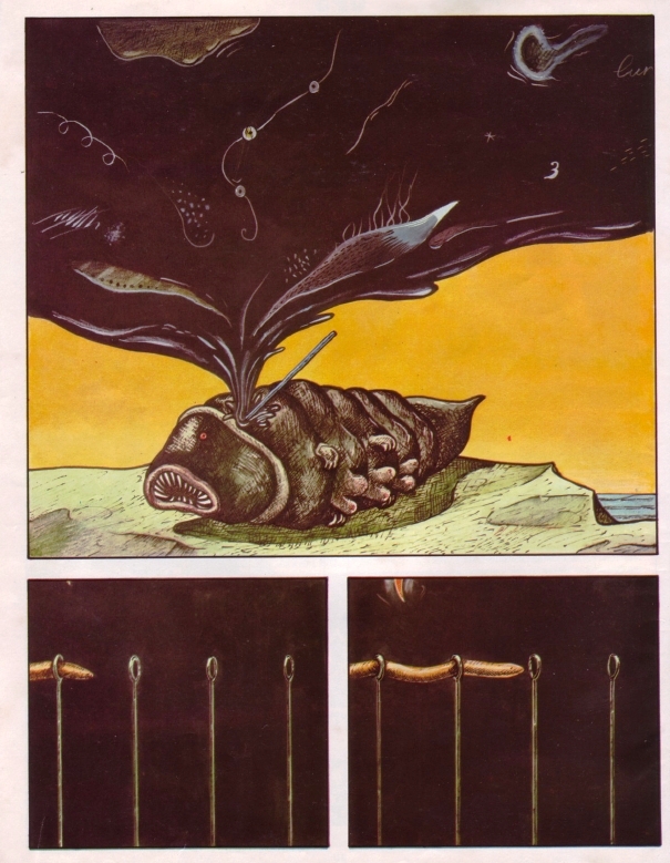
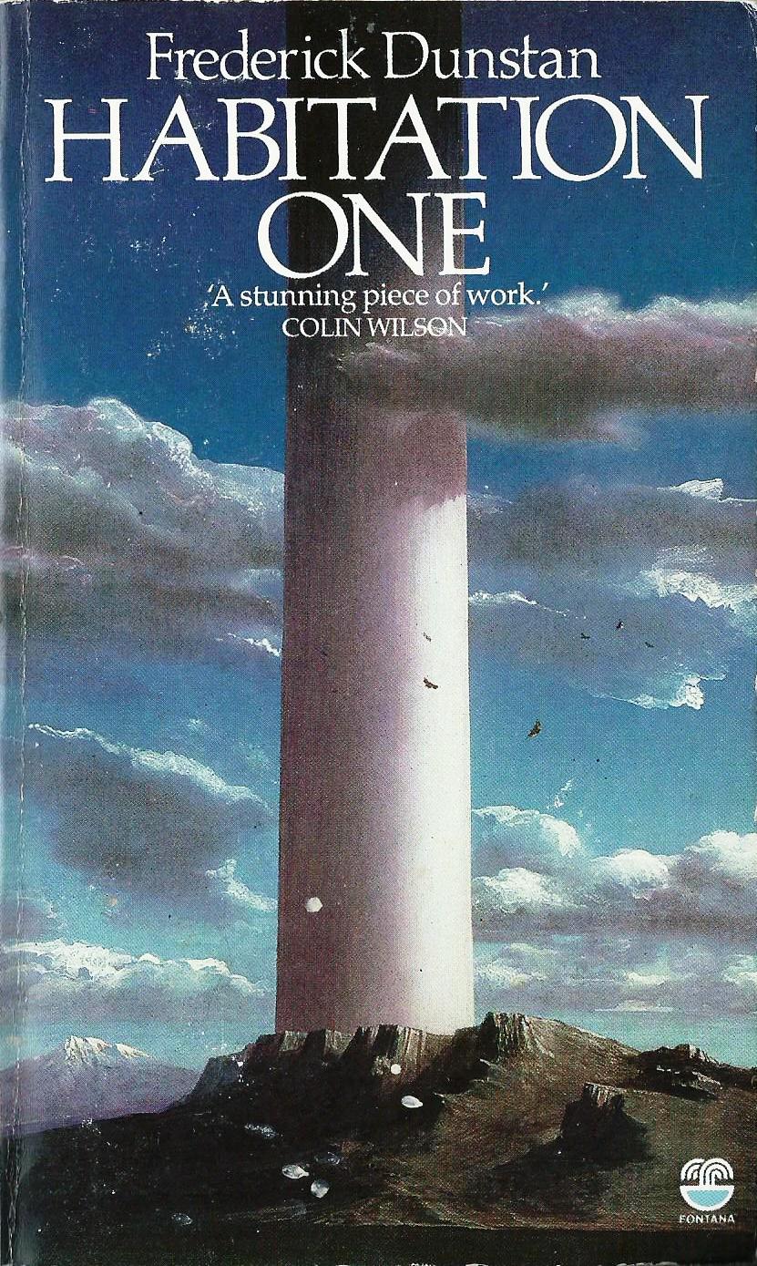
The novel is set in the year 2528, centuries after a combination of wars and eco-disasters have rendered the Earth a wasteland. The Remainder of Humanity – 1200 people – lives within the eponymous Habitation, a massive doughnut-shaped structure four miles in diameter, erected on an enormous column rising miles above the Earth’s surface. Within the Habitation rests an ecosystem resembling a rustic English village. The awareness of the Habitation as a post-apocalyptic arcology has been long forgotten by the successive generation of residents; to them, the interior of the Habitation is all the world they know.

As the novel opens, there are winds of change penetrating the simple existence of the residents of the Habitation. The mysterious machineries that supply the arcology with its electrical power and water are starting to break down; food harvests lessen with each passing year, and the population is starting to slowly, but inexorably, decline.

Settle, the middle-aged Librarian of Habitation One, leads a group of five residents, called The Scribaceous and Anagnostic Society, who regularly meet to discuss and debate Habitation society, mores, and politics. Not quite outcasts, but also not content with the direction the Habitation’s ruling class have taken, the Society is intrigued when Settle discloses that his efforts to explore the partially ruined floors of the Library have led to access to previously closed-off rooms and galleries.

Within these dust- and debris-covered rooms are ancient artifacts and databases, and a store of knowledge that can either save the Habitation......or doom it. For the revelations Settle has uncovered about the history and origins of the Habitation are not going to be received with equanimity by all of its residents……….

‘Habitation One’ belongs to the sub-genre of sf in which a closed, post-apocalyptic society ignorant of its origins comes to a ‘conceptual breakthrough’ occasioned by a degree of psychological, religious, and cultural trauma. It has a quirky originality that keeps it from being routine, however.

The author’s prose style, while frequently self-conscious and awkward (have your dictionary at hand to look up ‘coacervation’, ‘assentience’, 'insalubrious', and ‘manducate’), is really no worse than much of the prose appearing elsewhere in sf during the late 70s and early 80s (and here Donald Kingsbury's Courtship Rite, and any novel by Gene Wolfecome quickly to mind). The plot takes its time to unfold, but the narrative gets propelled by regular episodes of violence, some of which are frank Splatterpunk. While these Splatterpunk episodes were repugnant to the reviewers at 'Goodreads', they do lend urgency to the growing conflict stealing upon Habitation One.

Summing up, while I can’t recommend ‘Habitation One’ as a must-have example of 80s sf, if you happen to come upon it during one of your trips to the bookstore, it is worth picking up.

Tuesday, May 16, 2017

OPS from Totem magazine

OPS
from Totem No. 6, 1977


Totem - subtitled 'The Magazine of New Comics' - was the Spanish version of Metal Hurlant and began publishing in 1977, the same year that Heavy Metal debuted in the USA. 

Totem was published rather irregularly from 1977 to 1994. While much of its content was made up of translated material from Metal Hurlant, it also ran additional content from other European sources, such as 'Corto Maltese' episodes. 

One of the strangest, weirdest, but most original of these unique strips to appear in Totem was 'OPS', which was published in issue No. 6 (1977). The artist is unattributed. It's too bad 'OPS' never ran in Heavy Metal.........the magazine's stoner readership would have reacted well to it..........


Saturday, May 13, 2017

The Rook Archives Volume 1

The Rook Archives: Volume 1
Dark Horse Books, April 2017


The story goes that in 1976, James Warren thought the time was right to bring back the Western genre, and cowboy heroes, to popular culture. He contacted Bill Dubay, an editor at Warren, and Howard Peretz, an executive at the California toy company Package Play Development, and asked them to create a Western hero (Warren and Peretz apparently wanted to market toys and other collectibles based on the newly created concept).

After some contemplation, Dubay and Peretz came up with a character that combined both Western and sci-fi themes: a time-travelling cowboy named Restin Dane, who went by the nickname 'The Rook'. 

Restin Dane was a brilliant inventor who, in 1977, used his unique time machine - styled in the shape of the eponymous chess piece - to travel to the Alamo, in order to save his great-great-grandfather Parrish Dane from being among those who perished in the battle against the Mexicans.

The Rook first appeared in Eerie No. 82 (March 1977 cover date). The series quickly proved to be one of the most popular franchises in Eerie, and the character was given his own magazine in 1979. The Rook lasted for 14 issues before it ended, with all of the other Warren titles, in early 1983. 
Dark Horse is issuing the complete inventory of Rook comics in a series of hardcover volumes, modeled much like the Archives editions of Creepy and Eerie released by the New Comic Company. The Rook Archives: Volume 1 reprints six Rook adventures first published in Eerie issues 82 - 85 (March - August 1977) and 87 - 88 (October - November 1977).

The Rook Archives: Volume 1 features a Forward written by Ben Dubay, nephew of Bill Dubay, in which Ben fondly recalls a childhood visit with Uncle Bill in the summer of 1982 that led to Atari videogames, and introductions to artists and illustrators working for Warren. Prior to his death in 2010, Bill Dubay requested that his nephew return the Rook to glory, and the release of the Archives is one part of the fulfillment of that quest.
As with the Creepy and Eerie Archive books, The Rook Archives: Volume 1 is a quality publication, printed on heavy stock paper. It's hard to tell if the contents are scans made of the original artwork (much of which vanished in Warren's bankruptcy proceedings) or from actual printed magazine pages. But all in all, the images hold up reasonably well considering they were first created 40 years ago.


Bill Dubay was editing and writing a considerable proportion of the content for the Warren magazines during 1977 and his plots for these first few Rook episodes tend to have a straightforward, humor-centered approach. The emphasis is on employing the time travel aspect of the character to explore the Old West. It's only with the last story  in this volume, 'Future Shock', that the sci-fi elments become center stage, along with a more downbeat, melancholy tone to the script.

The Spanish artist Luis Bermejo provides all the artwork for these inaugural episodes. His distinctive drawing style, with its use of heavy contrasts of black and white, works reasonably well in terms of rendering the Old West landscapes among which most of The Rook's adventures take place.
So, who is going to want to read The Rook Archives: Volume 1 ?  It's a good question. I suspect that Baby Boomers are going to be the primary audience. I can't see comic readers under 40 being all that taken by DuBay's plots, which as time went on become more oriented towards the campy, tongue-in-cheek humor that DuBay eventually would fully unleash in the pages of Warren's 1984 and 1994. And Bermejo's artwork is simply too abstract in nature to have much appeal to a younger readership raised on contemporary outline-oriented art that is expressly designed for coloration using PC software.

Summing up, if you're a fan of the old Warren magazines and The Rook, or perhaps someone interested in proto-Steampunk, then picking up a copy of The Rook Archives: Volume 1 is worthwhile.

Wednesday, May 10, 2017

Book Review: Pillars of Salt

Book Review: 'Pillars of Salt' by Barbara Paul

1 / 5 Stars

‘Pillars of Salt’ (183 pp) was published by Signet Books in April, 1979. The cover artist is Paul Stinson.

According to the biographical sketch provided in the book, Barbara Paul is a liberal arts major, with a doctoral degree in Theater History. ‘Pillars’ was her second published sf novel. Her other sf novels include ‘An Exercise for Madmen’ (1978), ‘Bibblings’ (1979), ‘Under the Canopy’ (1980), and a Star Trek novel, ‘The Three-Minute Universe’ (1988).

The novel opens in 2051, when so-called Time Visiting is a major scholarly pursuit. It involves clamping electrodes to the user’s head, after which he or she reclines on a couch and enters the mind of a long-deceased person, there to spend days (or even as long as a week) as a silent observer of all that their host sees and feels. The advent of Time Visiting is not without controversy, as some citizens regard it as an unethical and morally questionable practice. However, for historians and artists, it is a revelation to temporarily occupy the mind of historical personages.

(Paul carefully avoids the obvious question as to whether anyone has Visited Jesus, but she does reveal that Mohammed has been parasitized by these unique futuristic voyeurs !).

The heroine of the novel is a young college student named Angie Patterson, who, while occupying the mind of Queen Elizabeth in 1562, discovers that Elizabeth died of smallpox – an event in conflict with recorded history. However, her panic at finding herself unexpectedly occupying the body of a dead woman allows Angie to resurrect Elizabeth on the latter’s deathbed.

This discovery raises questions about whether the process of Time Visiting has altered history. Angie Patterson find herself teaming up with a group of researchers to examine the issue further….and in due course, confronts the unsettling possibility that travelers from Earth’s future may have played as big a role in tampering with the past……..

‘Pillars of Salt’ is not very good. I struggled to finish it, giving up multiple times before grimly slogging to the finish.

Most of the narrative is preoccupied with relating conversational exchanges among the lead characters rather than dealing with time travel per se. The sci-fi underpinnings of the novel are superficial (we never are given any details of the theories governing Time Visitation). 


The main purpose of ‘Pillars’ seems to be to allow the author to expound on historical events. This can become tedious; for example, one chapter, which deals with the Battle of the Kasserine Pass in North Africa in February 1943, expands on the battle's strategic and tactical background, before segueing into another chapter which discourses on the experiences of four GIs involved in Kasserine combat. The presence of these chapters makes 'Pillars' seem like a historical novel, masquerading as a science fiction novel.

The Big Revelation (about time travel and interference by visitors from the future) that the plot seems to promise never really arrives in the final pages, giving the novel’s denouement an unconvincing tone. In my opinion, ‘Pillars of Salt’ can safely be passed by.

Sunday, May 7, 2017

Masters of Spanish Comic Book Art

Masters of Spanish Comic Book Art
by David Roach
Dynamite, April 2017


This book originally was scheduled to be published in January of 2017, but it actuality it didn't come out on store shelves until April. 

So, how does the book present ?

Overall, it's pretty good.

The opening chapters of the book provide a chronological overview of the work of Spanish artists in the comic book, magazine, paperback book cover, commercial art, and fine art realms of Europe and the U.S. from the early 1900s to the 1980s. 

Author Roach (who comes by his expertise in the Warren magazines and Spanish comic art legitimately, as the author of The Warren Companion, 2001, and The Art of Jose Gonzalez, 2015) does a good job of informing readers that the memorable work done by Spanish artists for Warren, Marvel, Skywald, and other U.S. publishers in the 70s and early 80s was only a part of the tremendous amount of art furnished by artists at such Spanish agencies as Selecciones Illustradas, Bruguera, and Bardon. 


The abundance of talented graphic artists in Spain meant that the Spanish commercial art market couldn't accommodate all of them, so many of the artists profiled in the book first began working for English publishers in the 50s and 60s, on romance and war titles. The adaptability of the Spanish artists meant that, after the end of the Warren magazines in 1983, many readily found work in providing cover and interior art for a host of German and Italian publications, such as the hugely popular Western series Tex.


The introductory chapters are followed by the artist profiles, which take up the bulk of the book. Major figures in the field, such as Rafael Aura Leon (aka 'Auraleon'), Jordi Bernet, Victor de la Fuente, Jose Gonzalez, Esteban Maroto, and Felix Mas all get several pages, while other artists may have one or two pages.

The book closes with a chapter, 'A New Generation', that looks at the work of  a newer generation of Spanish artists, including Ruben Pellejero, Daniel Torres, David Rubin and Ana Miralles, many of whom work for major U.S. and French comic book publishers on a variety of titles.
You can find reviews at amazon about Dynamite's lineup of hardcover comic art books, particularly its Vampirella compilations, which criticize these volumes for poor color, or black and white, reproductions, as well as the omission of pages from the original art. While Masters of Spanish Comic Book Art doesn't reproduce any comics in their entirety, and so the 'missing pages' complaint is moot, I can say that Masters has very good color reproductions, printed on quality stock paper.

One area, however, where the book does fall short is in the large number of typos; while I can overlook a few here and there, the typos in Masters often are a distraction. I don't know where in the production process these creeped in, but it speaks to a need for better proofreading.
One thing Masters of Spanish Comic Book Art succeeds in doing, is sparking interest in the large body of work that has yet to be translated into English and showcased for an American audience. 

For example, throughout the early 80s, the Spanish magazine (revista) Cimoc, which could be considered the equivalent of Heavy Metal, printed some outstanding work by many of the artists profiled in the book.


Also of interest is Rambla, one of the 'adult' revistas that marked the boom in fantasy art magazines in Spain during the 80s. 


Whether the content of these revistas ever will be formatted for an English-speaking readership is uncertain, as no collections in Spanish, equivalent to the 'Archives' volumes published for the Warren titles, have (to the best of my knowledge) ever been released.

Summing up, Masters of Spanish Comic Book Art certainly stands out as a great overview of a topic of interest to anyone who likes comic book and graphic art, the American black and white horror magazines of the 70s, Heavy Metal / Metal Hurlant, and the large body of comic art presented in publications in the UK and Western Europe. These fans will find the book to be a worthy reference, an entertaining read, and in many instances a nostalgia trip.

It's less clear whether anyone under the age of 40 will find the book a must-have. As author Roach points out in the book's last chapter, 'A New Generation', few if any Spanish artists still use the highly textured, pencil- centered approach to comic art that marked the generation that contributed to the American magazines of the 70s. 

With no black-and-white magazines such as Creepy or Vampirella on the stands anyone, and most contemporary comic book content rendered in computer-assisted color, most modern readers of comic books have little, if any, familiarity with the illustrative styles that dominated comic book publishing over forty years ago. However, those younger readers who do elect to peruse the pages of Masters of Spanish Comic Book Art are sure to find material here worth their attention.


Thursday, May 4, 2017

Paradox Part Two

Paradox
Part Two
by Bill Mantlo (writer) and Val Mayerik (art)
from Marvel Preview No. 24 (Winter 1980)