Sunday, July 5, 2015

The Sacred and the Profane

The Sacred and the Profane
by Dean Motter (plot) and Ken Steacy (art)
Graphic Novel, Eclipse Books, 1987


The Sacred and the Profane first appeared as a five-part series in the black and white indie comic Star*Reach in 1977 - 1978. Archie Goodwin later approached the creators about publishing a revised, colorized version of the series in Epic Illustrated. The new series was launched in the October, 1983 issue and continued through the October, 1984 issue.
This 1987 Eclipse Books graphic novel compiles all of the Epic Illustrated episodes, as well as a sketchbook section, commentary by the authors, and an Introduction by Archie Goodwin.


The premise of the story is that in 2043, the SETI array receives a transmission from space, a transmission that suggests the presence of intelligent life in the Andromeda galaxy. A few years later, the Vatican announces that it is converting most of its assets to fund a small fleet of spaceships. Their goal: travel to the Andromeda galaxy, and proselytize to whatever aliens are responsible for sending the transmission.


Carrying a mixed crew of 215 clergy, nuns, and laypeople, in 2047, the St. Catherine sets off on its fateful journey to the stars.


Even before the St. Catherine has reached the region of space thought to contain the transmission's point of origin, there is dissent and argument in the ranks, fueled by both personal and philosophical intrigues.


But when the St Catherine does indeed encounter the alien life-form, all internal struggles must be set aside....for the alien does not appear to be friendly, and the ship soon is invaded.....and the lives of the entire crew put at risk. 


Will the peaceful acquiescence recommended by the clergy be enough to deter the aliens ? Or is the violent response advocated by the secular members of the crew the more effective path ? Either way, time is running out aboard the St Catherine......and soon it will be too late for anyone to have any hope of survival....


Unfortunately, TSATP is best regarded as a comic book concept whose reach exceeded its grasp...........

Writer Motter seeks to infuse the storyline with 'deep' questions about spirituality, organized religion, self-identity, the Validity of the Other, etc., etc. As a result, the plot is overwhelmed by having too many passages of dialogue in which various characters berate, argue, remonstrate, debate, and cavil at one another.

The aliens - which are never really given much in the way of substance or explanation - serve a simple function as a sort of 'cosmic' Rorschach Blot upon which the crew of the St. Catherine project their existential angst and emotional insecurities.


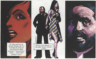
A pretentious storyline can sometmes be salvaged by great artwork, and at first glimpse, Steacy's artwork seems to accomplish this. It has a distinctive style, calling to mind the melding of art deco with medieval, stained-glass imagery.


The problem is, the comic book / graphic novel printing technology of the 80s could not really accommodate this style, and as a result, the artwork looks murky and underexposed, making it difficult for the reader to figure out what, exactly, is taking place among the crew of the St. Catherine.

Steacy's artwork also suffers from being static in terms of its presentation; blocky and underlit, the action sequences lack the 'traditional' comic book visual enhancements - such as speed lines, impact bursts, and sound effects - that would impart a necessary degree of dynamism to the depicted activities. 


As well, the fact that much of the narrative revolves around scenes of conversations means that, with the exception of some brief, Star Wars - derived spaceship battles that take place early on in the story, Steacy rarely gets the chance to do much in terms of breaking free of the overly 'talky' nature of TSATP.

Summing up, TSATP is best viewed as an overly ambitious effort to create an sf comic that sought to transcend the (arguably) simplistic approach that marked much of the content present in the genre during the 70s and early 80s. 

For a comic series that was first published in 1977, in some respects it was ahead of its time; in other respects, particularly in light of the advent of the sophisticated but entertaining European approaches to sf comics that would come to be showcased in Heavy Metal magazine that very same year, it was an effort that missed the mark.

Friday, July 3, 2015

A Gothic Tale

A Gothic Tale
by Richard Corben
Story by Tom Veitch
from Richard Corben Complete Works vol. 3 (Catalan Communications 1987)

Originally published in Skull comics No. 7, November, 1972, this comic was later reprinted in volume 3 of Catalan Communications' Complete Works compilation of Corben's underground and indie press works.


Tuesday, June 30, 2015

Heavy Metal magazine June 1985

'Heavy Metal' magazine June 1985


June, 1985, and on the radio and on MTV, 'Don't You (Forget About Me)', by Simple Minds, is in heavy rotation.


The latest issue of Heavy Metal magazine is out, with a front cover by Jim Cherry.

The Dossier section for this issue shows all the telltale signs of an 80s periodical whose staff have gotten access to PC-based 'desktop publishing' software. ....visible somewhere amidst the "...hey ! Look at this cool effect !" confusions are interviews about low-budget zombie movies; reviews about even more low-budget, obscure videos; word of a Stephen King newsletter; and an advertisement for the old-school art book by Roger Dean, Magnetic Storm.


The graphic / comic content of this issue is middling in terms of quality.There are further installments of Moreno's 'Rebel', Findley's 'Tex Arcana', Corben's 'Bodyssey', and Torres's 'Whisper Mystery'. 

Charles Burns's 'El Borbah: Bone Voyage' series is the best of these, and concludes in this issue. I've pasted this installment below.


Friday, June 26, 2015

Book Review: Lost Worlds

Book Review: 'Lost Worlds' by Lin Carter

2 / 5 Stars

‘Lost Worlds’ (176 pp) was issued by DAW Books (as No. 398) in August 1980. The cover artwork is by Enrich.

All but one of the eight stories presented in this volume were previously published, in the interval from 1967 – 1976. All are pastiches of one pulp author or another, and display Carter's skills (if one could call them that) at aping the vocabulary and diction of the styles of the pulp era.

The stories in ‘Lost Worlds’ are organized by the mythical continents in which they were set; these include Hyperborea, Mu, Atlantis, Lemuria, Valusia, and Antillia.

The two ‘Hyperborea’ stories are pastiches of Clark Ashton Smith tales; these include ‘The Scroll of Morloc’ and ‘The Stairs in the Crypt’. They are more horror stories than fantasy, and both adhere faithfully to Smith’s prose style, including the use of some of the more obscure words in the English language.

‘The Thing in the Pit’ is a Lovecraft pastiche; a foolhardy wizard calls forth an Abomination which threatens the very existence of Mu.

Lemuria is the home for two of Carter’s ‘Thongor’ stories. ‘Thieves of Zangabal’ sees our hero making a dangerous foray into the lair of an evil wizard, while ‘Keeper of the Emerald Flame’ has Thongor investigating a lost temple within which eldritch mysteries lurk to harm the unwary. Both of these stories are the better ones in the anthology; they are Conan clones, but reasonably well-written.

‘Riders Beyond the Sunrise’ is a King Kull story, set in Valusia; as with the Thongor stories, it’s a competent pastiche of Howard’s writings. This tale sees King Kull pursuing a rival into a forbidden territory, where Kull discovers, to his misfortune, that magic has provided his quarry with unforeseen powers.

In his Introduction to ‘The Twelve Wizards of Ong’, set in Antillia, Carter states that with this story, he was attempting to evoke the literary stylings of James Branch Cabell, Clark Ashton Smith, and Jack Vance. Whether or not you think this is wise (and I certainly don’t), the story is nearly unreadable due to its clotted prose.

The final entry, ‘The Seal of Zaon Sathla’, is set in Atlantis and deals with a self-confident wizard who desires the fabled Seal; alas, he lacks the means to pay for it…….

Summing up ‘Lost Worlds’, well……at the time it was written, fantasy was still an emerging genre, and Carter one of its foremost practitioners. There wasn’t a great deal of material being published, and thus, Carter’s sheer output of fiction– however mediocre much of it was – meant that he was showcased by default when it came to publishers like DAW Books.

I doubt there is much here that would interest contemporary fantasy fiction fans, but DAW Book completists may want to get their copy.

Tuesday, June 23, 2015

Frank Miller's Robocop

Frank Miller's Robocop
Steven Grant (script) and Juan Jose Ryp (art)
Avatar, 2003 - 2006


trade paperback compilation, Boom! Studios, August 2013 

The Robocop franchise has bounced around several comic book publishers since the original movie first was released in July, 1987. Marvel was the initial franchisee during 1987 - 1990, followed by Dark Horse from 1992 - 1994, and then Avatar from 2003 - 2006. 

In 2010 Dynamite took a turn, and more recently, Boom! Studios has been the publisher.

The best of all these Robocop comic book series are Dark Horse's Robocop Vs The Terminator (1992), and Avatar's Frank Miller's Robocop (2003 - 2006). 


Acquiring the individual books in Frank Miller's Robocop is rather expensive, particularly when you take into account the existence of numerous cover variants, which the fanboys have held onto in the hopes of receiving exorbitant resell prices. Probably the best way to acquire the series is to pick up the trade paperback compilation, titled Frank Miller's Robocop Volume 1that Boom! released in 2013.


The story goes that Frank Miller's initial script for the film was deemed 'unfilmable' (whatever that means), and the script used in the actual filming had been subjected to considerable re-writing. Accordingly, Frank Miller's Robocop relies on the 'original' script and deviates in many aspects from the film. 


I won't disclose any spoilers, save to say that it does share with the film the epic confrontation between Robocop and the super-powerful 'Robocop 2' cyborg, within which is implanted the brain of an amoral, homicidal personality.


I thought Robocop 2 was a great film, with plenty of black humor well-served by the over-the-top violence. Does Frank Miller's Robocop do a good job in its particular version of the story ? The short answer is yes, it does.

First and foremost, this comic series is all about the work of Spanish-born artist Juan Jose Ryp, one of the most talented artists working in comic books nowadays.


With all nine issues of Frank Miller's Robocop, Ryp's unique draftsmanship is on full display, aided and abetted by an impressive coloring job from Nimbus Studios.

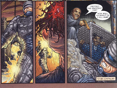
To call Ryp's pencil work 'meticulous' and 'detailed' is an understatement.....it often takes me several minutes to completely take in the contents of a single panel, much less an entire page........! 


When Ryp draws a gunshot wound - as he does in the center panel above - he doesn't just draw a gout of blood. He draws little fragments of skull bone and shreds of tissue travelling outward from the exit wound - !


Curs snarling at each other in the street have patches of mange on their fur. Little puffs of smoke accompany the friction of a police car's tires scraping the asphalt.


Explosions and fireballs are carefully rendered to show individual plumes and contrails of flame, accompanied by fragments of atomized limb...

Ryp provides plenty of Easter Eggs and in-jokes for the discerning reader. For example, look carefully at the bottom portion of the back cover to issue 6.....


Do you see Homer ? 

Note the detail of the warping and pitting and discoloration of the rebar just to upper left of Homer's head. It must have taken Ryp an entire day - if not longer -  to draw just this bottom portion of the back cover of this one issue. Insane !


The 'sequential adaptation' (as opposed to writing or scripting) by Steven Grant does the right thing in adopting a 'European' style, minimizing sound effects and limiting the superposition of text to spoken-word balloons. There are no narrative boxes or thought balloons. There is little in the way of distraction from Ryp's artwork.


Avatar is one publisher that is very conscious of printing its comics with high production values, and the issues of Frank Miller's Robocop benefit from this approach, as the books use a glossy, high-quality paper stock with very good color reproductions.


The comic book series has its share of laugh-out-loud, satirical humor. One of my favorite sequences is this one involving 'Johnny Rehab':


Summing up: whether you're a Robocop fan, or simply someone who appreciates great graphic art, getting a copy of Frank Miller's Robocop is a very worthwhile investment. It'll be a long time before anyone tops this deliverable from the franchise.......