Saturday, December 5, 2015

The Art of Horror by Stephen Jones

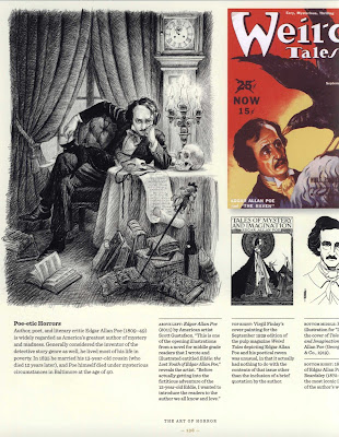
The Art of Horror: An Illustrated History
Edited by Stephen Jones


Every year at Christmastime I try and review a 'coffee table' book that offers something noteworthy in terms of being a gift for the sci-fi / fantasy / horror fan. 

Some years there's not much to choose from, while in other years, there might be a number of worthwhile candidates.

This year, there is no doubt: the choice is 'The Art of Horror', edited by Stephen Jones.

If you know someone who is a sci-fi, fantasy, or horror fan, then you can be confident they will love seeing this coffee table book under their Christmas Tree.


'The Art of Horror: An Illustrated History' was published in September, 2015 by Applause Theatre & Cinema Books. At 10 x 0.8 x 11.2 inches and 256 pages, this book is too big to fit entirely on my scanner. It's a very well-made hardbound book, with a heavy cloth cover and quality stock paper. 

The reproductions of the artwork are high-resolution - even those of long-ago pictures, cinema advertisements, and magazine and book covers.


The book covers the field by topic, rather than chronologically.


The book's format wastes no space - the use of small font allows for several illustrations on each page, with the periodic placement of some striking full-page art here and there throughout the contents.


Readers with any familiarity with horror-themed art and commercial illustrations will undoubtedly recognize more than a few of the images in this book, but there are many that were new to me, and signal that editor Jones, and his contributors, know this material, and the intended readership, very well.


The book's coverage of horror media is primarily centered on the USA and Europe, which may disappoint some readers.[To be fair, however, the field is so large that it probably will take another volume to cover horror art from outside those areas.]


The book covers horror media from the 19th century, on up to the present-day.


As the best books of this type are wont to do, you're sure to see old paperbacks and magazines that you don't have in your collection, and - your interest piqued - you'll be making arrangements to procure that stuff....


Perusing the pages of 'The Art of Horror', I was struck again and again by the inclusion of offbeat, obscure little gems of artwork and illustration. So even hardcore fans of horror art are sure to find novelties throughout the pages of this book.


Summing up, 'The Art of Horror' belongs on every fan's shelf. At $25 or less (not including shipping) from your usual online retailers, this book is good value for the money.....and an affordable purchase, too. 

Get it !

Thursday, December 3, 2015

Epic Illustrated December 1985

Epic Illustrated
December, 1985 No. 33
Issue 33 of Epic Illustrated, released in December 1985, was the next-to-last issue of the magazine, which had debuted in the Spring of 1980. 

In his answers to letter-writers aggrieved over the cancellation, Editor Archie Goodwin was cryptic about the reason for the magazine's ending, but it was quite evident that Epic, which was birthed as an effort by Marvel to capture some of the readership of Heavy Metal, had never really succeeded as an alternative to that magazine. This was due to Goodwin's less than inspired editorship, and to the fact that Marvel's management was reluctant to run the explicit T & A and violent content that so engaged the stoner fans of Heavy Metal.

Indeed, looking at the contents of the December 1985 issue of Epic, one is struck by the presence of too much material that tries to achieve either a kind of offbeat, kooky humor ( 'Dr. Watchstop','Snicker's - That's Entertainment'), or instead a faux-profound Sense of Artistry ('Ein Heldenstraum') that, either way, comes across as insipid and trite.

There are, however, some good stories in this issue of Epic Illustrated, and one of them is 'Fish Story', by Mike Baron (plot) and John Totleben (art). I've posted it below.

Monday, November 30, 2015

The Vampires are Coming

The Vampires are Coming
by Doeg Moench (script) and Isidro Mones (art)
from Vampirella No. 29, November 1973


An atmospheric tale of vampires loose in the Revolutionary War. 

'Munes' was the pseudonym used by the talented Spanish artist Isidro Mones, who did a lot of memorable work for Warren magazines in the 1970s.


Friday, November 27, 2015

Book Review: Inner Eclipse

Book Review: 'Inner Eclipse' by Richard Paul Russo


3 / 5 Stars

‘Inner Eclipse’ (376 pp) was published by Tor in February 1988; the cover artwork is by David Mattingly.

This was the first novel for author Richard Paul Russo, who is nowadays a well-recognized, award-winning sf author, mainly for his ‘Carlucci’ trilogy of novels that mix the cyberpunk and detective story genres.

The protagonist of ‘Eclipse’ is Benedict Saltow, a young man with a mutation that enables him to feel the emotions of others at a distance. The rarity of such ‘First Order Empaths’ in the Federation makes them sought-after individuals who are valued as advisors for all manner of political and economic undertakings – particular those of the clandestine kind.

As the novel opens, Saltow is adrift in a prolonged state of self-pity on the planet Triumvirate, a sort of world-spanning city-state. A previous assignment has gone bad, and left Saltow with post-traumatic stress disorder that manifests as crippling seizures (in the 80s, PTSD was a very ‘in’ thing with which to afflict characters in sf novels and short stories).

Saltow is hoping for something – anything – to happen to break his self-imposed passivity. This is accomplished when he is contacted by a corporate mercenary named Ryker, who offers Saltow a unique job: accompanying Ryker on an expedition into the trackless jungle of the planet Nightshade, there to determine if rumors of intelligent, alien, humanoid life are true.

Despite his mistrust of Ryker, Saltow agrees to accompany him on the expedition. In due course, Saltow and Ryker travel to Nightshade, and there link up with other two members of the team: a smuggler named Renata, and the backwoods trader named Gerad.

As the expedition sets off into the hinterlands of Nightshade, it becomes clear to Saltow that Ryker is utterly amoral, and as much a danger to the lives of the team members as any outlaws and narco-barons in the jungle. But Saltow’s obsession with First Contact overrules his misgivings…..and when violence begins to coalesce around the expedition, Saltow is obliged to put his trust in Renata and Gared. But they have their own reasons for wanting to find the aliens……reasons that may not guarantee safety for Benedict Saltow……..

In terms of its prose style, ‘Eclipse’ is a well-written novel, particularly for a first novel, but it suffers from the lack of a compelling plot. Most of the narrative is preoccupied with staging one scene after another in which Saltow finds himself pondering his existential anomie, an anomie resulting from his empathic gift (or curse) and his struggles to overcome the psychological barriers that inhibit his emotional exchanges with other people. These scenes are often cast in a Blade Runner aesthetic marked by continuous rain, mist, and moody contemplation.

The expedition that forms the centerpiece of the plot doesn’t even get underway until the last third of the novel, and its denouement has an underwhelming, perfunctory character that really doesn’t justify wading through the first two-thirds of the novel and its labored documentation of Benedict Saltow’s efforts to identify, and overcome, his profound personal alienation from society.

Summing up, many of the themes and ideas that Russo explores in ‘Inner Eclipse’ are those that are also examined in his latter novels, such as the Carlucci series; but those novels also provide more engaging plots, and I recommend them over ‘Eclipse.’

Monday, November 23, 2015

Operation Omega by Denis Sire

Operation Omega
by Denis Sire 
from the October, 1977 issue of Heavy Metal magazine


The French artist Denis Sire (b. 1953) began publishing his work in Metal Hurlant in 1976. 

When its American counterpart Heavy Metal launched in early 1977, Sire's strips were translated into English and regularly featured, primarily through the loosely connected episodes of the 'Diabolical Planet / Great Trap' (Menace Diabolique) series, starring the hero Maurice Leblanc (translated into 'Morris White' for American printing).


Sire's comics in the late 70s issues of Heavy Metal, with their striking use of black and white linework, stippling, and shading, and an Art Nouveau / Retro stylistic sensibility, were instantly recognizable. And, needless to say, Sire's incorporation of pinup imagery into his reimagining of the 'Flash Gordon' sf adventure tale also appealed greatly to the magazine's stoner readership and signaled that here was something very new in American comics.

[In the early 80s his color comics series, Willy's Wood, also became a regular Heavy Metal feature, but I found it disappointing, being an obsessive depiction of Betty Page - inspired, softcore porn.]

Here's the standalone story 'Operation Omega', scanned from the original magazine pages at 200 dpi.


Saturday, November 21, 2015

Conelrad

Conelrad


What with Fallout 4 now on store shelves, and the rockin' tune 'Atom Bomb Baby' part of its soundtrack.....


.....the timing seems right to post about a unique website called Conelrad.

Conelrad, which I've been following off and on for several years now, is devoted to documenting postwar American pop culture and its references to atomic war / WWIII. There are pages devoted to Cold War era civil defense media, including feature films, public service announcements, radio and television broadcasts, newspaper articles about hypothetical bomb drops on U.S. cities, and (of course), warnings about Commies and the Red Menace. 

I remember some of this stuff from when I was a kid in grade school in the 60s, learning how to duck under my desk to shield myself from an atomic blast.....


One can spend hours poring over its extensive inventory of artifacts from this time period, which cover just about every nuance of the Cold War and its love / hate relationship with The Bomb and atomic energy.


One drawback to the site is its design, which - for whatever reason - is not at all user friendly. It has a strange Left-Justified, one-third page format which may have been current in 1997....... combined with its small font, this formatting gives the site a cramped appearance and makes it difficult to navigate.


When all is said and done, however, Conelrad is a site worth visiting.